
Small Dining Room Wallpaper Ideas: Pattern, Light, and the Wall Behind the Buffet
Room ideas · Living & dining rooms
A small dining room can handle character. The useful question is how the pattern works with the table, buffet, light and view—not whether a room is “too small” for wallpaper.
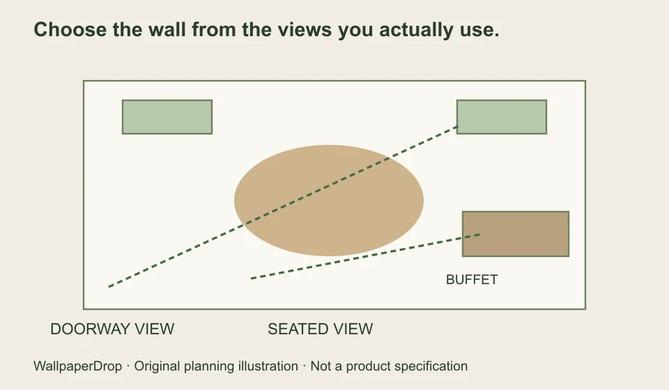
Read the room before choosing the pattern.
List the pieces that will stay: the table, chairs, buffet, flooring, curtains and a light fixture. Note the strongest existing colors and the shapes you see repeatedly. Wallpaper can echo one of those elements, or introduce contrast, but it does not have to compete with all of them at once.
Take two photographs. The doorway view tells you which wall you notice on entering. A seated view shows the pattern you will spend time looking at. A wall that dominates one view may barely appear in the other.
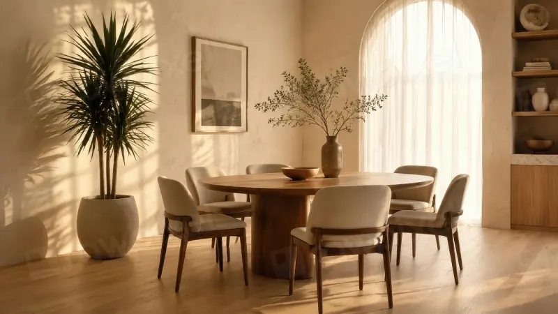
Compare the same room at three motif scales.
A pattern looks different when its motifs are seen around a buffet, mirror or curtain. Rather than deciding that small rooms always need tiny prints, compare the motif with the visible wall area and the furniture in front of it.
A small motif can read as an overall texture from the doorway. A medium motif can make the individual shapes more apparent. A large motif needs a composition check: which parts will still be visible when the furniture and artwork are in place? None of those outcomes is automatically better.
Compare the motif with the furniture
Keep the buffet and picture in place while changing the size of this original schematic motif.
Small motifs repeat frequently; compare the overall texture from the doorway.
This is not a product scale selector. Confirm the actual design’s repeat and sample before ordering.
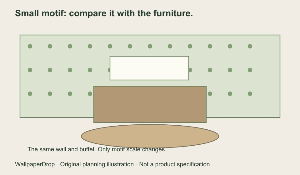
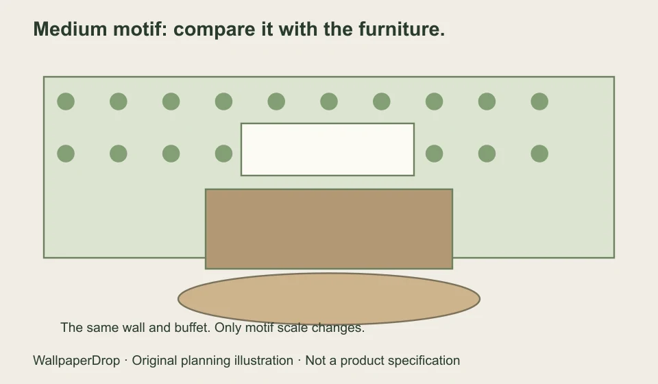
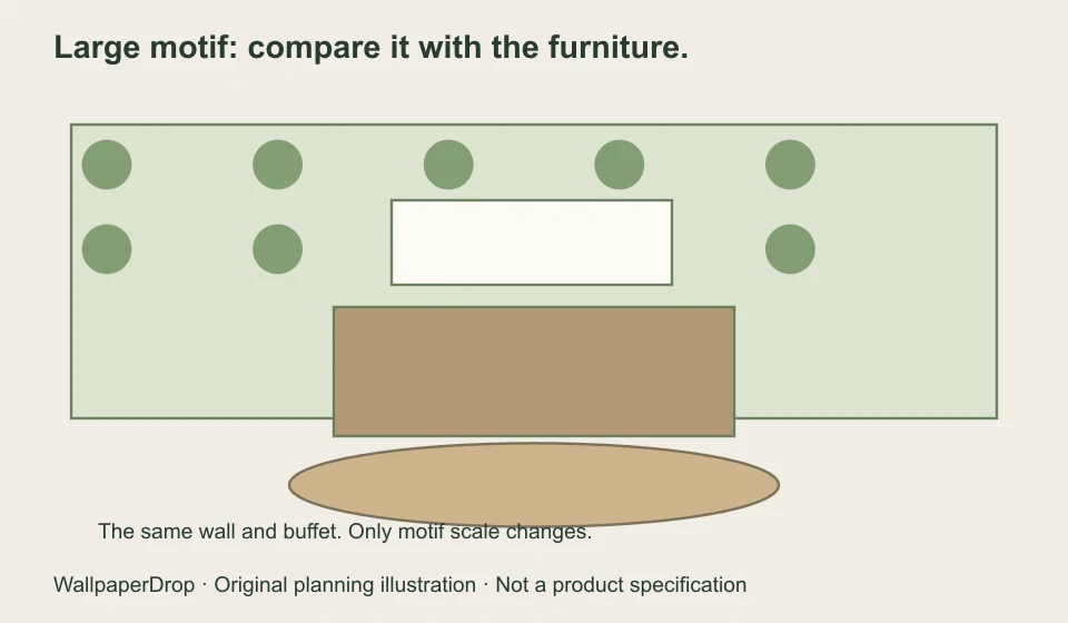
The comparison uses an original schematic pattern, not a product simulation. Keep the actual manufacturer’s repeat dimensions beside a sample when making the final choice. A digital scale control is not proof that a particular design is available at that scale.
Wallpaper behind the buffet: plan what the furniture hides.
Draw the top of the buffet on the wall sketch. Add anything above it—a mirror, framed picture or shelves. The most important wallpaper area may be a narrow band around those objects rather than a full uninterrupted wall.
Try these three approaches:
- A repeating pattern: check that the visible fragments still feel intentional around the buffet and artwork.
- A stronger focal motif: position it so the furniture does not cut off the part you want to see, using the supplier’s actual layout options.
- A scenic mural: review the crop with the furniture silhouette overlaid before approving the proof.
Leave the artwork in your comparison if it will stay. A patterned wall that feels balanced when empty may look very different once a detailed picture is hung in front of it.
Build the palette from materials you can actually compare.
Choose one supporting color already in the room: a wood tone, curtain thread or chair fabric. Then compare wallpaper samples beside it. If several existing materials are visually busy, a quieter wallpaper treatment may be easier to balance. If the furniture is simple, a more expressive wall may be a good direction to test.
Look at the sample in daylight and with the lights you use during dinner. A phone photograph, screen preview or generated room image cannot establish the color or finish of a physical print.
| What stays in the room | A useful comparison | What to check |
|---|---|---|
| Warm wood and cream upholstery | Muted greens, warm neutrals, or a contrasting darker ground | Whether the sample feels compatible with the wood in evening light |
| Strong patterned curtains | A quieter motif or a limited shared color | The two patterns together, not in separate photographs |
| Simple furniture with little detail | A clearer botanical or graphic motif | The visible scale around the buffet, artwork and openings |
Choose one wall—or more—by looking at the joins.
A buffet wall can provide a clear place to start, but it is not automatically the right accent wall. Ask how the paper ends at corners, door frames or an open-plan transition. Check whether that stopping point looks intentional from the doorway.
Papering more than one wall can create continuity; using one wall can focus attention. Both need a plan for the furniture, adjoining paint and pattern joins. There is no universal rule that light paper makes every small room larger or that dark paper always makes it smaller.
Use a short checklist to make the final decision.
- Can I see the part of the pattern I like after adding the buffet and artwork?
- Does the scale make sense from the doorway and from the table?
- Have I compared the sample with the actual floor, wood, fabric and evening light?
- Is the selected material suitable for this wall and its conditions?
- Have I checked repeat dimensions or approved the mural crop?
Print the pattern comparison or save your own room sketch as a planning reference, then use a physical sample for the final material and color decision. If the paper is a mural, request a proof using your dimensions and furniture position.
Explore patterns for your dining room
Browse botanical and floral wallpaper for leafy and flower-led designs. Compare the full artwork with your buffet, doorways and lighting, then check the available material on the product page.
Image credits and scope
The room illustration is from Rawpixel; the comparative room plans and motif graphics are original WallpaperDrop planning diagrams. They do not show a purchasable wallpaper, a customer installation, or a tested material. Styling suggestions are options to compare, not rules or promises about a room’s perceived size.